Plan a first visit
Find hours, parking and activities.
Participants had trouble locating practical details.
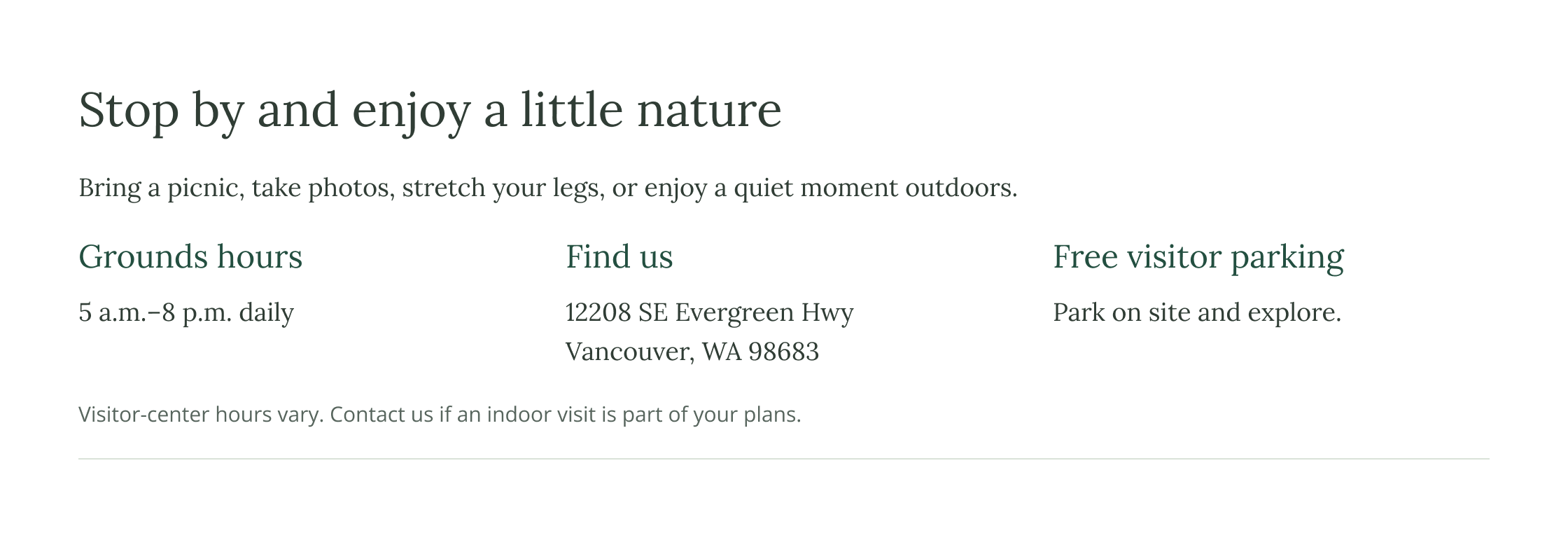
I grouped hours, the address and free parking near the top of the Visit Us concept.
Nonprofit · Columbia Springs
Helping visitors and trip organizers find their next step.
Columbia Springs wanted visitors to find essential information more easily. The team suspected the site could be streamlined, but needed evidence of where people struggled. I used usability testing and a heuristic review to identify friction and inform Visit Us and Field Trips concepts.
Stakeholders felt the website held too much information, but were unsure what to shorten, consolidate or reorganize. They were open to navigation improvements and other small adjustments.
Where do visitors and trip organizers encounter difficulty finding the information they need to plan a visit or request a field trip?
I moderated sessions with three participants, all first-time users of the website. Each attempted four core tasks. I tracked their navigation and interpretation of instructions.
Across tasks, participants repeatedly backtracked, scanned the wrong pages and asked for assistance. Some searches took more than ten minutes.
Find hours, parking and activities.
Participants had trouble locating practical details.
I grouped hours, the address and free parking near the top of the Visit Us concept.
Explain how to request a trip and what happens next.
Some participants were unsure whether to request dates or join a waitlist.
“I'm either supposed to pick three dates and email them or just [use] the waitlist?”
The concept puts request guidance alongside program choices and preparation links, with a clearer explanation of the next step.
Find guidance for the adults accompanying a trip.
Some participants could not find the materials; another was unsure the teacher packet was right. This supported grouping preparation links with the rest of the trip information.
Find an appropriate program, cost and duration.
All three participants found a program. Some needed extra scanning to compare options, and one suggested filtering by grade—an idea for further exploration.
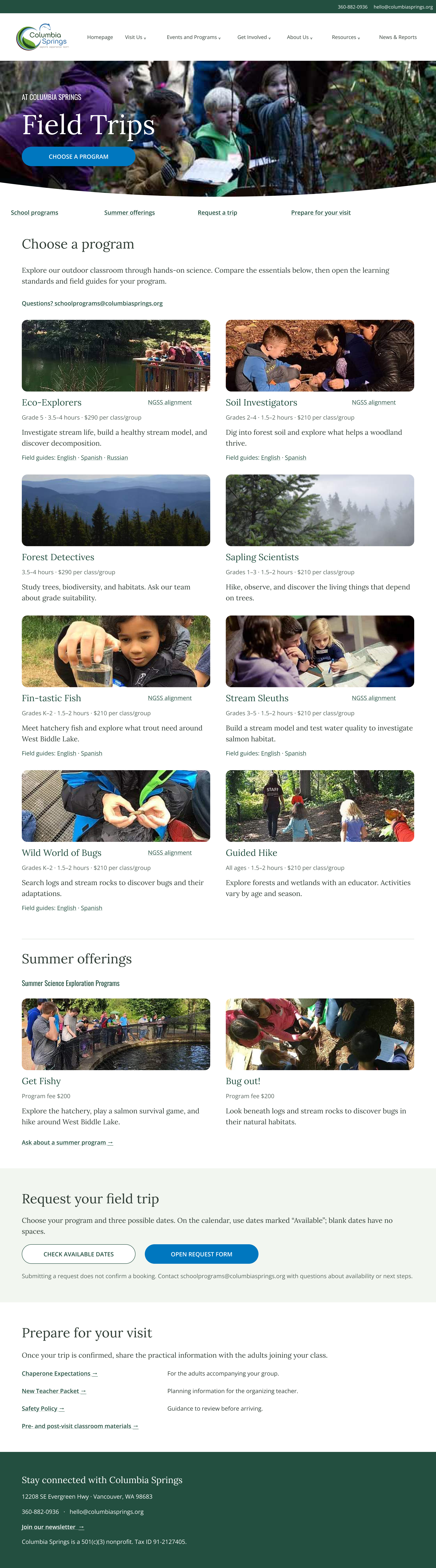
Participants moved between pages to find program details, request steps and preparation materials. This simplified route combines paths observed during testing with my map of where that information lived.
Overview and preparation links
Compare activities
Calendar and waitlist
Return for preparation links
Choosing a program, requesting a trip and preparing for it are connected stages of one task, so bringing them onto one page would reduce the need to search back and forth. Section links would let visitors jump to the stage they need without scanning the entire page.
See the consolidated Field Trips concept ↓I reviewed the main visitor and field-trip pathways for consistency, clear labels and obstacles to completing tasks. These were the clearest content fixes.
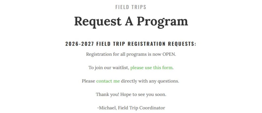
The overview suggested programs had not resumed. The request page announced open registration alongside a waitlist, without making the relationship between availability, requests and the waitlist clear.
Suggested change
Keep availability information consistent and explain when to request dates, join a waitlist and expect confirmation.
“Visit Us Today” opened Contact instead of Visit Us. “Teacher Resources” opened EcoExplorers activities rather than general trip-preparation materials.
Suggested change
Send the visit button to Visit Us. Rename the resource link to describe its activity-specific content, or send it to the preparation resources.
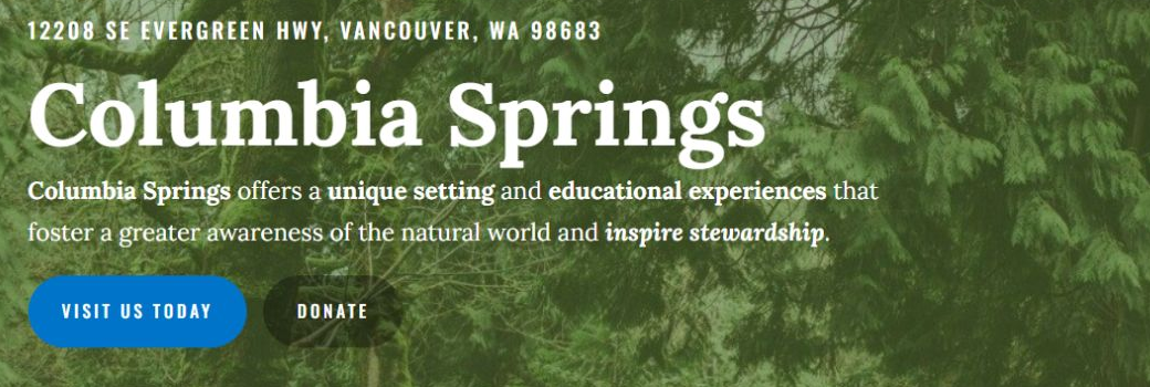
Opens Contact ↓

The 2019 annual report and old park-code link led to missing pages. Restore the report and update the policy link.
Grade, duration and fee details varied between entries. Present them consistently, keeping photos, summer offerings and NGSS links.
Desktop checks covered keyboard navigation, text contrast, link labels and heading structure.
2.4:1
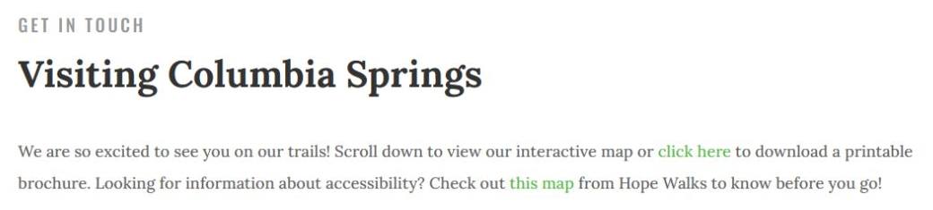
The green “this map” link measured about 2.4:1 against white, below the 4.5:1 minimum for this text.
Darken and underline it, and name the destination: “Download the accessibility map (PDF).”
Keyboard navigation skipped the submenu links. Add an operable toggle, visible focus and an announced open/closed state.
Tab skipped the 22 interactive pins. Provide keyboard-operable pins and a text list of the same locations.
“Field Trip Progams” was ordinary text rather than the page heading. Correct the title and use a clear heading hierarchy.
I developed two concepts from low-fidelity sketches, then used ChatGPT (Astra 6) to help render the page designs. Both retain Columbia Springs’ photography and identity.
Hours, address and free parking move near the top. Activities, the map and visitor guidance remain.
View larger concept ↗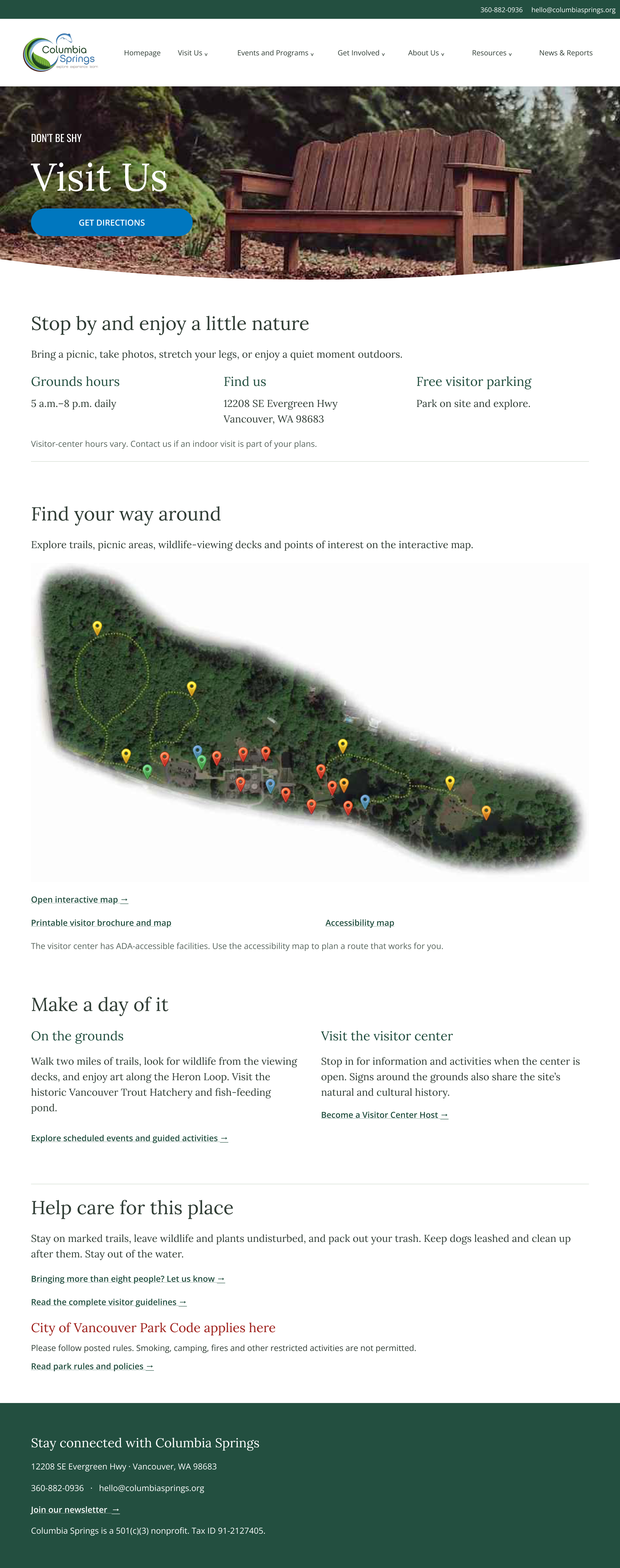
Program choices, request steps and preparation links share one page. Photos, summer offerings and NGSS resources remain.
View larger concept ↗I enjoyed the kickoff conversation. It helped me focus on stakeholders’ priorities and understand which changes were realistic for the team.
I would review comparable nonprofit websites before the kickoff to ask better questions about balancing detailed programs with essential visitor information. That context would help me explore what could be shortened or grouped while preserving what the community needs.